Brand and media kit
The mark, and the files to use it.
Everything on this page is free to use when writing about Ilayer. Please use the files rather than a screenshot: the mark has a small-size drawing of its own and a screenshot will not have it.
Overview
The whole system on one board
The mark, how it opens, how it is drawn, the palette, the type, and what survives at 16 pixels.
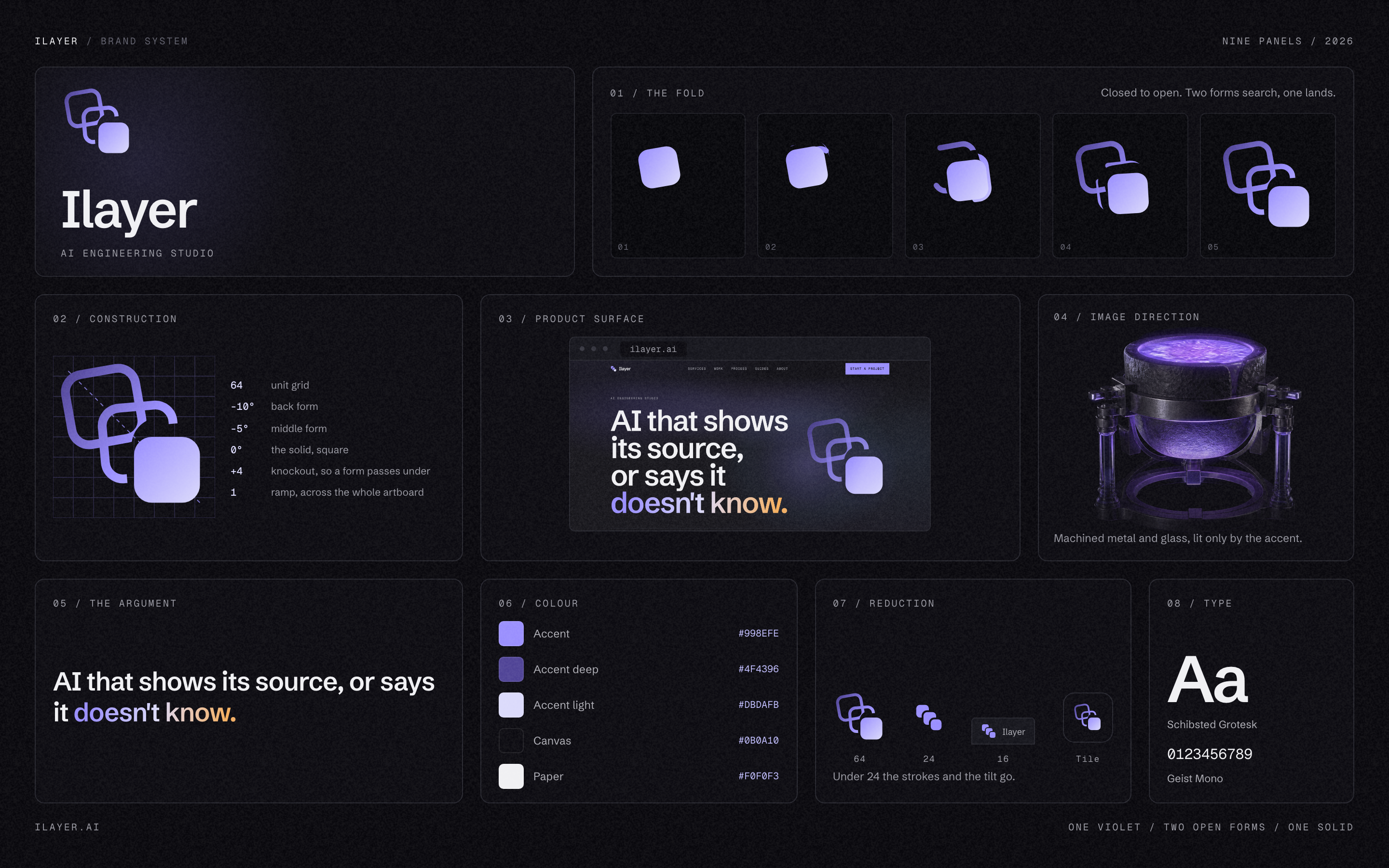
Take it as ilayer-brandkit-2026.png, 2880 by 1800.
The mark
Two open forms and one solid, stepping down and coming square.
Two open forms and one solid, stepping down a diagonal and coming square as they go. Layers being searched, then an answer that has settled. The open-to-solid grammar is the mark's whole argument: a system either produces something it can stand behind, or it produces nothing.
- Grid
- 64 units. Every coordinate in the small-size drawing is a multiple of four, so a 16-pixel favicon lands on whole pixels.
- Small sizes
- At 24px and below the mark drops its strokes and its tilt and becomes 3 solid squares. A 3.5-unit stroke is under a pixel on a 16px favicon.
- Clear space
- Leave the height of the solid element on every side.
- Colour
- One violet. The mark never carries a second hue.
Files
Download the mark
The whole kit is one archive. Below it, each mark on its own: SVG for anything that can take a vector, and the small-size drawing for favicons and anywhere under 24 pixels.
Take the whole kit in one file
The mark in every colourway as SVG and as PNG, the small-size drawing, the app icon, the board, and a note saying which file goes where.
ilayer-brandkit-2026.zip
 ilayer-mark-gradient.svgThe primary mark. Use this on a dark ground wherever a gradient will survive.
 ilayer-mark-violet.svgOne flat violet. Use where a gradient will not survive, or on a busy ground.
 ilayer-mark-light.svgRetuned for a light ground. The accent alone is too pale on white.
 ilayer-mark-white.svgSolid white, for photographs and any single-colour dark context.
 ilayer-mark-black.svgSolid black, for one-colour print, stamps and embroidery.
 ilayer-mark-micro-violet.svgThe small-size drawing: 3 solid squares, no strokes, no tilt. Use under 24 pixels.
Every mark above is in the archive as a PNG as well, at 256, 512 and 1024 pixels. So is the app icon, ilayer-appicon-1024.png, and the small-size mark in one colour for print. To read the usage note without downloading anything, open README.txt.

Two more sit under social/ in the archive, sized for a LinkedIn Page rather than drawn for anything: ilayer-linkedin-logo-400.png and ilayer-linkedin-cover-1512x256.png. The logo carries an opaque ground because LinkedIn renders a transparent one on white, where the back layers of the mark lose their front-to-back reading.


Colour
One violet, one canvas
The mark never carries a second hue. Amber appears on the site, once, for an answer that was held back, and it is not part of the mark.
- Accent#998efeThe mark, links, one control per view.
- Accent deep#4f4396The mark on a light ground.
- Accent light#dbdafbThe bright end of the ramp.
- Canvas#0b0a10The page. Everything sits on this.
- Paper#f0f0f3Text on the canvas, and light grounds.
Type
Schibsted Grotesk
Everything a reader reads. Semibold for headings, regular for body.
Geist Mono
Labels, figures and anything that has to line up in a column.
Icons
Three paddings, one mark. The iOS tile leaves 19 percent margin because a tile that fills its square looks larger than every other icon on a home screen. The maskable tile leaves 24 percent, because an Android launcher may crop to any shape and only the middle 80 percent is guaranteed to survive.
 iOS
iOS Maskable
The name
Ilayer, one word, capital I and nothing else. Not iLayer, not ILayer, not I-Layer. In running text it takes no article: Ilayer builds, not the Ilayer builds.